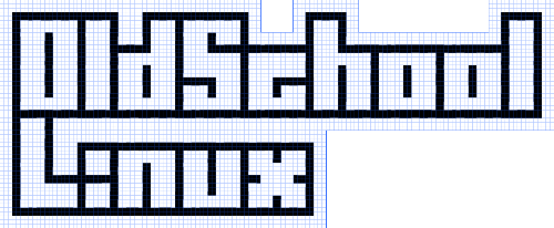
There’s a new logo for Oldschool Linux.
I hand-created (pixel-by-pixel) the c64 character map. I did it in, of all places, Inkscape as .svg. I did it using squares, and it’s pretty rough. I’m not so sure about some characters, but it’s all there.
I couldn’t find a proper character map out there, so I ended up installing emulators. I ended up with Frodo and a spectacularly small window since it was in a VirtualBox virtual machine. I had to take screenshots with KSnapshot and zoom in to see the pixels of some characters.
I also confirmed that my old art knowledge has bled away. I can’t remember how to do the other primary character style! Man, that’s really depressing. =( I can forgive forgetting how to do a lowercase s, and being confused about making a nice lowercase c, but.. to lose an entire style? Gah!
This basic line style is trivial, but the other style allows for a spectacular array of colours. I’ll have to get one of the oldschoolers to whip something up.
Now, the logo is nice and all except for a couple of issues.
- I do want to be able to take the white background and convert it to transparency or any arbitrary colour. I wonder how I would do that.
-
Why in the heck don’t I have a white background? Why are there grid lines? There is no stroke on those objects, so why are there blue bounding boxes around each item? Heck, it’s not even consistent, it’s nasty and uneven.
I didn’t even want to get into colouring the parts, that would take a while and I don’t want to bother right now.

